How to Transition Your In-Person Event Online

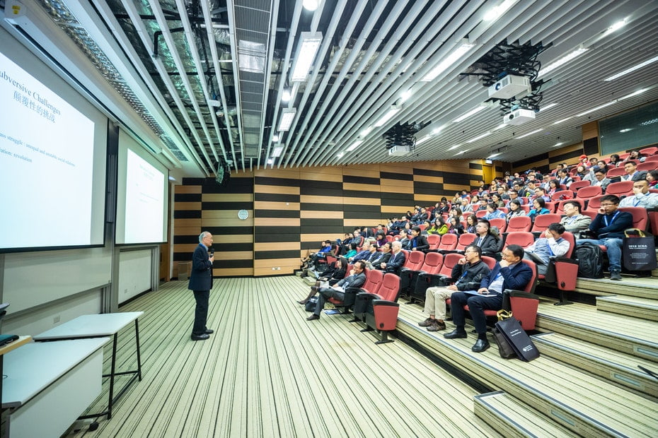
A speaker stands in front of large projection screens in an auditorium full of people.
Photo by ICSA from Pexels

A lot changed in 2020. From our personal lives to professional endeavors, pretty much everyone has had to make adjustments and transitions to a new way of life. One of these transitions was the increasing need for virtual events. Given that people could not travel or gather in the same place, transitioning in-person events to online was the way to go. 

While it’s frustrating for many, there are multiple benefits to hosting events online. Once traveling and gathering is safe again, there are many reasons to continue to hold events virtually. So if you haven’t figured out how to transition your in-person event to online yet, this is a perfect chance to learn!

Why transition your in-person event online?

After a year of purely virtual events, most people have found there are some rather unexpected benefits to this format. Some people actually prefer virtual events to in-person.

Virtual events are often more accessible for people who find traveling challenging, expensive, or time consuming. Attendees can save time simply attending the event in the comfort of their home. It is also much less expensive; previously you might need to book a flight and hotel to attend a conference in another state or country. Now, the cost of admission is all you need to consider. All of these things lower the barrier for entry for many people.

Attendees can take in information at their own pace with online events. Before, if a conference had many tracks or rooms, you could only attend one at a time. But now, virtual events can provide attendees with both synchronous and asynchronous options. Watch some talks live, and catch up on others via recordings later. 

From the organizer’s side, the challenge of finding the perfect venue can be completely eliminated when all one needs is a computer screen and internet connection. Event space can be difficult and complicated for event organizers to secure. Skipping that hurdle altogether can mean a lot.

And for organizers, online events can be less expensive overall. The cost of the venue itself, food and snacks, security, insurance, and other expenses might be removed entirely when transitioning an event online. 

What kind of events can be transitioned from in-person to online?

You might be wondering whether your event can be hosted virtually. Chances are it can! Let’s take a quick look at some examples of events that work well online.

  • Workshops and webinars can still provide interactive educational elements to teach attendees what they want to learn.
  • Courses and lessons can mimic a classroom setting if need be.
  • Talk-based conferences can still feature speakers and panels and utilize chats for Q&A.
  • Church services can still unite people for worship safely.
  • Meetups/community gatherings can bring people together over a common topic in a more casual way.
  • Fundraisers can still raise money with online giving tools and live updates. 
  • Happy hours and other informal social gatherings can be just as fun with virtual games.

Did we forget any event types? Let us know in a comment below!

How to Transition Your In-Person Event Online

If you’ve organized an in-person event before, many of the same steps remain necessary. Organizing an event – no matter the format – will require some of the same skills and processes. But there are some specific things to consider that are unique to online events.

Maybe you’ve held a few virtual events and are looking to up your game. Or maybe you are just now considering transitioning your in-person events to virtual. Either way, here’s how to do it!

Do Your Research 

Make sure you learn what your attendees need from this event before you begin planning. If you’ve organized this event in-person before, reach out to previous attendees. Ask what they liked about the last event and what they would change. What kind of content are they looking for right now? Have they attended virtual events recently? What did they like about those events?


Think back on your own experiences as well. What were some challenges you encountered with the last event that virtual solutions could solve? Have you attended any other virtual events recently? What did they do well? There is nothing wrong with borrowing some ideas and taking inspiration from other great events.

For example, Brian Richards has years worth of experience hosting virtual tech events. He is great at teaching how he does it. Check out an interview with him here, in which he shares how to take an in-person event and host it online instead.

Make sure that no matter what research you do at this point, you are looking at the event through the virtual perspective. 

Start With Smaller Virtual Events

If this is your first virtual event, try to host a few small ones first for practice.  For example, a private workshop can give you some experience with marketing. A small exclusive meetup can give you some practice with all the technology and software you’ll need to use. It is often impossible to predict what challenges may come up until you actually give it a try. 

Make sure afterwards you get feedback from those events. Use that feedback to iterate and make sure that your full event goes well. 

Hosting small virtual events first can also be great for building awareness and potentially selling admission to your main event. Small events help build a sense of community that can be missing.

Pick the Right Software and Tools

We could write multiple posts on the kinds of software and tools to use for virtual events. It all depends on your budget and what exactly you need from that software. Let’s go over some of the basic things you’ll need to host a successful virtual event. 

The broadcast itself

Zoom has been the top pick for most virtual events these days. However if you prefer or need an alternative, look into GoToMeeting, Google Meet, or BlueJeans.  Skype, Facebook live, Instagram live, and Microsoft Teams are also good options.

Marketing

If your event is now entirely online, your marketing should be online as well. You’ll need to spend time promoting the event using online campaigns. Ask speakers and sponsors to share information about the event with their online audiences. Create interesting email campaigns to promote special features of the event. 

Use tools like Calendly, Doodle, Zapier, and Convertkit to boost your marketing and messaging. These will help automate much of your work and send out information quickly. Don’t forget to utilize the power of social media to drum up interest around the events as well. If you don’t have social media accounts for your event, you’re missing out!

Selling tickets

Provide access to the event with a ticketing system. Eventbrite is an extremely popular option that comes with an extensive amount of assistive tools to help you sell tickets and keep in touch with attendees. 

Team communication 

You’ll need to make sure that your event organizers are also in touch. Maybe before, you met in-person to plan the event. Now, transition to something like Slack, Asana, or Trello to keep track of tasks and deadlines. Google Docs and Google Sheets are also exceptional ways to collaborate on important documents for the event without needing to meet face to face. 

Be Mindful of Timezones

Now that your event is not limited by its location, it might be a good idea to reach for a larger audience. If your event is in New York, there is no reason someone in Los Angeles shouldn’t attend. Just make sure that you are being specific about time zones in all your marketing, ticketing, invitations, etc. That way, no one arrives too early or too late.

Most ticketing systems will help you with those conversions. You can use tools like Time and Date to generate calculated links that make dealing with multiple time zones easier.

Offer Unique Virtual Benefits

It is not enough to take an in-person event and just repeat it through a Zoom call. It’s important to take advantage of the new medium and offer some unique benefits and features to attendees. 

Offer replays and recordings of content after the event is over. Since everything is online, hitting “record” is much easier than setting up cameras and microphones in a live event. This is a huge plus because if someone can’t make the event, they still may be tempted to sign up if they know they can watch it later. 

Provide downloads and other deliverables for events like workshops. Workbooks or sheets are extremely valuable resources that attendees can use during the event. If you can’t mail out swag, offer virtual prizes like virtual gift cards or discount codes that can be used immediately. 

Live chats before, during, adn after content are extremely valuable. Usually, speakers don’t have time to answer a lot of questions in addition to delivering a talk. But if they can be online throughout the day, this makes Q&A much easier. 

One huge benefit of hosting events online instead of in person is the ability to provide captions or translations. If you are transitioning your in-person event online, take the opportunity to connect with a captioning company. You have the option to use live captions if the talks are live, or get captions for pre-recorded sessions. If your audience is global, connect with translators to make the event accessible to more people. This is much easier to do online than in person.

Don’t forget about speakers and sponsors

Much of the draw for speakers (especially unpaid ones) and sponsors is face-to-face time with attendees. Since this is not an option for virtual events, make sure to provide additional benefits for the people who are volunteering time or money to make your event happen.

Mail out speaker gifts or swag after the event to show your appreciation. Give speakers extra promotion in emails and on social media.  Hold longer live Q&A sessions so that speakers can connect with attendees on a deeper level. Provide a Slack channel or breakout room just for Speakers so they can connect and network with each other. All of these things can provide additional benefits and show speakers how much you appreciate them.

Sponsors should receive similar treatment. Make sure they get ample promotion before, during, and after the event. Virtual booths have become popular ways to link sponsors with attendees. A virtual booth can be a main hub or video chat room where sponsors can provide exclusive content, contact information, or one-on-one conversation. 

Did we forget any important factors when it comes to transitioning from in-person events to online? What is your favorite part of online events that you’ll miss when we go back to in-person ones?  Leave them in a comment below!

And don’t forget – in-person and online events need websites! Your website is your central hub for sharing information and keeping organized. We always recommend WordPress for event websites. And of course, your WordPress site still needs hosting! Look for hosting that is lightning fast, has active support, and prioritizes security. If you don’t put care into also picking the best WordPress hosting, you are wasting your beautiful site design. 

Cloud22 checks every box. We manage your updates – making sure that when your theme developer releases an update or patch, you get it right away. We back up your site, just in case you make a wrong move in your theme settings.  Our servers are integrated with LiteSpeed cache and Cloudflare CDN, so the beautiful design you used your theme to build is served to visitors quickly.


How To Pick The Best WordPress Designer

Top down view of a laptop on a desk with drawing tools sprawled out around it.

The mark of a great website is that it proves to be a good return on investment. When planning out that kind of website design project, a lot of boxes need to be checked. You’ll need to ensure that the site is fast and secure. You need to have the option to make updates when you need to do so. The site needs to function well and provide an optimal user experience for visitors. 

And on top of all of that, it needs to look good. That is where a designer comes in. Great designers know how to meld aesthetics and functionality to create an experience people love. 

Luckily, the WordPress CMS is optimized to get you further ahead with all those goals. That is why we recommend working with WordPress designers over all! 

Figuring out how to pick the best WordPress designer for your project can be a daunting task. There are a lot of factors to consider. How can you determine the perfect person? 

In this post we’re going to touch on all the things you should do to prepare for picking the best WordPress designers. (Although the following can be applied to designers of any type!) We’re going to talk about what things to look for when researching and hiring. We’re going to talk about important red flags to avoid. Then, we’ll run through a short list of places you can find great designers online.


Let’s get started!

What to Do Before Picking Your WordPress Designer 

There are a few things you should read up on and collect before you start interviewing website designers. The entire process will be easier if you know what you need ahead of time. This will make it much easier for you to rule out designers who don’t fit.

Start by doing some research. 

Examine the websites of some WordPress designers to see what kinds of services they offer. Gauge the average cost of their website projects; it’s good to have a ballpark idea of cost first. Look into the things you need vs. the things you already have, like a logo, hosting, or domain name. Look at other websites in your industry and compile a list of links that you can use as visual inspiration.

Next, collect information about what you need for your site. 

That way you can make sure the designer you choose can match those needs. Ask yourself questions like:

  • How big does your site need to be? How many pages or posts will it be?
  • What is your timeline? Is there a set date or time of year by which the website needs to be done?
  • What is your budget? What is the amount you’d like to spend and the maximum amount you can spend?
  • What are some must-haves in terms of functionality? These are things that are non-negotiable and top priority.
  • What are some nice-to-haves in terms of functionality? These might be things you can add on in the future.
  • Do you need graphic design, copywriting, or SEO services, too?

Write down all your answers in one place. Have these questions ready when you start chatting with designers. Knowing this information ahead of time can help you rule out some designers as you look through their websites.

Also, give some thought to what kind of experience you’re looking for. 

You might be working with this designer for months. It’s important that you can get along with them and communicate well with them. It doesn’t hurt to find someone who has things in common with you! 

Also, think about the process you want. Are you looking for someone you can hire and set loose? Maybe you need this person to work with your team or an assistant most of the time. Or perhaps you want to be directly involved and have lots of one-on-one learning time with this designer.  

Knowing what to expect and what kind of relationship you want will help you gauge which personality type fits your goals best.

What to Look for When Picking the Best WordPress Designer

There are a lot of ways to qualify the designers you are considering or interviewing. Keep the following points in mind when comparing designers against each other. The importance of each of these points may vary depending on you, your project, and your business. 

Reviews and Testimonials

A website is a big investment. When you buy expensive items in your personal life, don’t you usually read a few reviews first? It’s important to determine how other clients feel about this person and what issues you may need to look out for.

Check out their website or any public review sites you can find them on. They may have a Facebook page with reviews or a LinkedIn profile with endorsements. Read through reviews and testimonials left by previous clients. What phrases or sentences are repeated often? If there are bad reviews, do they have things in common with each other, too? Reading reviews will give you a strong idea of this person’s strengths and weaknesses.

Also, check out the designer’s social media presence if they have one. If they have profiles where clients are interacting with them and tagging them, that’s a great bonus! If they don’t have any social media presence at all, that may be a red flag. (More on red flags later!)

Examine at Their Design Portfolio

A great designer is usually someone who is really, really good at designing within a certain style or industry in mind. Some designers specialize in ecommerce sites, restaurant sites, nonprofit sites, lifestyle blogs, etc. Finding a designer who can do “anything” should not be your goal. Know what kind of site you need ahead of time, then find a designer who caters to your industry.

This is not only important because it means they are familiar with your goals. It also means they are familiar with your audience. If they have designed a ton of sites for makeup artists, they probably have done a good amount of research into what someone is looking for when they come to a makeup artist’s website. This background means they can design with success in mind, not just aesthetics. 

Look at a designers portfolio to make sure that they have built sites in your industry before. It’s helpful if they have not only worked with your industry, but your desired style or tone. For example, if you run a high-end 5-star Japanese restaurant, someone who builds websites for local Mom and Pop pizzarias may not be a great fit, even though they have worked with restaurants.

Look for sites in their portfolio with similar functionality as well. If you need a WordPress site, make sure that WordPress is their speciality. If they primarily work with another CMS, they may not know very much about WordPress and may not be the best fit. If you need the site to be marketing heavy, or include a membership option, make sure they are familiar with those types of user experiences.

Give Serious Thought to Budget

This one is pretty straightforward: can you afford this person? There is no one “right cost” for a website. However, typically you can expect to get what you pay for. Paying more for a better website is almost always worth it. 

That being said, beware of overcharging. This is where it pays to research average costs and compare multiple designers. If you understand what a good ballpark is for a site of your needs, you can see exorbitant rates from a mile away.

Really zero in on what you are getting for the cost. For example, when interviewing a designer, ask them how they price their sites. Some price on how long they think the site will take to deesign. Some use activity based pricing, where each piece of the project is priced individually and then added up. If you can understand how the project is priced, you can truly understand the value of the work. If the designer can’t share how they arrived at the price, that may be a red flag.

Also find out what that designer may charge extra for. Some designers will foot the bill for specialized imagery or fonts. Some might charge extra. Some may help you get discounts on things like hosting and domain names, and some may not. 

Functionality 

While the design is an important part of a website, it’s not everything. Ensure that the designer keeps functionality and conversions in mind, as well as aesthetics. Pretty sites that don’t bring your business any benefit are not worth it. 

Ask the designer what their approach is to using color, imagery, and spacing within their designs. Do they have case studies you can read about how their designs created more conversions? Do they have examples of how a design they created improved a website’s functionality?

Some WordPress website designers don’t build sites, but just provide a design. This means they may send you a flat image that a developer can then build out. If this designer does not also build the site, ask about referral partners. Do they have developers they can recommend to you? Can they make recommendations for software you can use to build out the design themselves? Even if the designer just provides designs, they should be able to get you on your way to launch.

Project Style and Process

No two designers will take you through a website design project in exactly the same way. Everyone has their own method, process, and style. Remember that no one way is “correct.” But some may be better suited for you than others. 

Most designers will use a Discovery Call in order to explain their project style and process. They may even detail it out on their website. If you’re unsure, here are some good questions to ask:

  • How do they handle changes to the scope of the project? For instance, if you wanted to add a new page halfway through, what is the process for doing that?
  • How flexible is their timeline? If you needed to speed up the project for some reason, what is the process for doing that?
  • How many opportunities for revisions do you get? When do revisions start to incur extra charges?
  • Do they provide any website maintenance plans after launch? If not, can they refer someone to you?
  • What is their availability for questions and education before, during, and after the project?
  • Are they a designer and developer or just a designer? If they are a developer too, how could that affect the cost and timeline? 
  • What method of communication do they prefer? For example: phone, email, project management tool, etc.
  • When are they available for meetings or calls? How often can you schedule reviews with them?

Once you  have a full understanding of what the project process looks like, you are well on your way to finding your perfect designer. 

Red Flags to Avoid When Picking Designers

While researching and interviewing designers, keep an eye out for these red flags. These are not guaranteed signals that this designer isn’t good. But if they start to stack up, it’s time to move on!

Lots of bad reviews, all 5-star reviews, or no reviews at all

We talked before about the importance of reviews. When scoping out testimonials, there should be a healthy mix. Ideally, you want as many 5 star reviews as possible. But if they have a ton of reviews that are all 5 stars, that could be a red flag. They may be deleting or hiding negative reviews, which is not a good practice. 

Obviously, you want to avoid designers with a ton of bad reviews. An exception may be if those reviews are very old and the newer ones are better. That means they have learned from mistakes and done the work to improve. Personally, I would see this as a green flag!

And of course be suspicious if there are no reviews anywhere that you can read. This may mean that all their reviews are negative, or they are too new to have earned any yet. While hiring new or young designers is not a bad thing, changes are, you want someone with a good amount of experience.

Poor business website 

If their sales website for their services is poorly designed, that is a huge red flag. We all know the common phrase: “The cobbler’s kids never have shoes.” But that saying does have a limit. 

If their site is difficult to use, buggy, or slow, it’s possible your site may turn out that way too. Make sure their site is mobile responsive as well. Look for typos, generic fonts, and ugly stock photography. These will all give you an indication of their design style and attention to detail.

Can do anything or work with any CMS

No one is an expert at everything! It’s just impossible. 

If you encounter someone who says they can build any website with any CMS or is an expert in all software under the sun… walk the other way! It’s impossible to be truly proficient on every platform. If a designer claims otherwise, they might not be being honest. 

If they deliver sites on multiple CMS’s, they are probably cheaply outsourcing the work or making it up as they go along. At the end of the day, it will mean a poorly designed website for you.

Fixed cost websites

Avoid people who advertise too-good-to-be-true sales like “Any size website for $500!” This probably means that you will get a templated site without much care and attention. And even if the site itself is $500, you might find yourself with unexpected costs and fees down the line. 

If you are looking for the best WordPress designers, those are the ones who build sites custom. That doesn’t mean coded from scratch. But it doesn mean that they take what is special about you and your business into account. A good site should be uniquely priced depending on how long it will take and how much work is required.  

Where to Find Great WordPress Designers 

To wrap up, here are some good places to seek out WordPress designers. This is not a comprehensive list, but a great place to start! Is there a resource you enjoy for finding designers – comment below to let us know! 

Underrepresented in Tech

The Underrepresented in Tech database is an independent project created by WordPress community members. You can search the database and find people from underrepresented groups (women, people of color, people with disabilities, etc.) who work in WordPress. “Website design” is a specialization you can search for to narrow down your search results.

Upwork

You may have heard of this site before. Upwork is a popular database which you can use for finding freelance talent. Many people on Upwork are highly experienced and extremely serious about their work. The Upwork database provides you with easy to find reviews, portfolios, and more.

Jobs.WordPress.org

When looking exclusively for WordPress designers, you can narrow your search on jobs.wordpress.org. In this database you can narrow your search to find designers and developers, as well as professionals to help with theme customization, writing, performance, and more. The one thing they all have in common – they specialize in WordPress!

codeable.io

Codeable.io is a WordPress freelancer platform that connects those looking for designers and developers with talented professionals. Their process allows for you to provide a description of what you are looking for in regards to your project and then get quotes from those in their database. It’s a great way to go through the entire process of hiring a WordPress designer very fast.

Twitter

A big chunk of the WordPress community is on Twitter. It’s a popular place for people to chat, exchange ideas, ask and answer questions, and live tweet events. Send out a call for WordPress designers (make sure to use the #WordPress hashtag!) 

Word of Mouth

Like most freelancers, many WordPress site designers get jobs through referrals. Ask any friends or colleagues with nice sites who built theirs. Chances are, you’ll get a few solid recommendations just by asking around your professional circles. 

Footer of other sites you like

If you stumble across a website that you like out in the wild, scroll all the way down to the bottom of the site. Many website designers will add their company name and a link to their own website in the footer. You can follow this link to see who built the site and how to get in touch with them.

Did we forget any important factors when it comes to searching for the best WordPress designer? Did we leave off any vital red flags? If so, leave them in a comment below!

And don’t forget – when you’ve found your perfect designer, your WordPress site still needs hosting! Look for hosting that is lightning fast, has active support, and prioritizes security. If you don’t put care into also picking the best WordPress hosting, you are wasting your beautiful site design. 

Cloud22 checks every box. We manage your updates – making sure that when your theme developer releases an update or patch, you get it right away. We back up your site, just in case you make a wrong move in your theme settings.  Our servers are integrated with LiteSpeed cache and Cloudflare CDN, so the beautiful design you used your theme to build is served to visitors quickly.
Website Design Grants For Nonprofits

A jar of pennies turned sideways spilling its content out.

Part of the nonprofit struggle is choosing how to spend the money you raise. There is usually not enough funds to completely meet your goals. At the same time, investing in things like marketing and websites cost money as well. Nonprofit organizations of all sizes struggle with how to raise and allocate funds.

A great way to relieve the stress of this decision is to apply for grants. A grant can provide you with much-needed funds to accomplish a particular purpose. In this case, we are talking about website design grants.

In 2021, it’s no secret that a strong web presence can make or break your marketing. A good website can help you raise more money, attract more volunteers, and raise more awareness. But websites are not cheap, especially good ones. 

Today let’s talk about how to plan for, find, and apply for website design grants for nonprofits. 

How to determine a website budget

These days, launching a website is not as expensive as you may expect. But there is still a very real cost associated with a website project. There may be costs that you aren’t aware of. It’s important to determine a budget for your website project ahead of time. This way, you know exactly what size grants you’ll want to go after. In addition to that, if you win the grant, you’ll be ready to dive in with the development and design process right away. 

So here are some things to build into your nonprofit WordPress website budget. 

  • Hosting – The hosting account you choose is important to the overall security and performance of your website. We might be biased, but we recommend Cloud 22! 
  • SSL – Most hosts come with a free SSL certificate for your website. An SSL certificate encrypts your syte and makes it secure for accepting donations. If the host you choose does not provide a free one, make sure to budget for the cost of one.
  • Domain name – Domain names typically cost about $15-$20 per year. Ensure that the domain name you want is available and that you are aware of how much it will cost to purchase. You can often get a domain name through your hosting provider.
  • Themes – The theme you choose for your nonprofit website will determine how it works and how it looks. They vary widely in price; some are free and some cost a certain amount per year. Check out our post on how to choose the perfect WordPress theme for your nonprofit website.
  • Plugins – Depending on what you need your site to do, you’ll need to budget for specific plugins. There are many free ones, but the more power you need, the more you will pay. For example, the GiveWP donation plugin free. But if you need some specific features – like recurring donations – you’ll need to budget for a premium plan.
  • 3rd party tools – What tools will you need to integrate with your website for it to be successful? Maybe you want to use a 3rd party donation tool or email marketing tool. Make sure you know exactly how much it costs for the plan that you want.
  • Courses to learn – If you are going to build the site yourself, or have someone on your team build the site, you’ll probably want to invest in a course or two. YouTube has a ton of great WordPress tutorials, but it’s also a good idea to browse sites like LinkedIn Learning to find premium courses that you can follow along with. 
  • Developers/marketers to hire – If you don’t want to build the site yourself but instead hire a professional, gather some quotes for that. Many designers and developers offer discounts for nonprofits. Regardless, make sure you have a good idea of their project rates. 

How to find website design grants for nonprofits

Finding grants for nonprofits online is as simple as a Google search. Dedicate an afternoon to looking through Google to compile a list of forums, newsletters, websites, and applications that suit your needs. 

Remember that not all grants will be specifically for website design. Some may be for marketing or building operations. If you receive that grant, you can decide how to use those funds.

It’s a good idea to make a list of all the grants you can find, then parse them down according to 3 criteria. GetFullyFunded.com breaks this down perfectly: 

  • Geographic Fit– Funders typically choose to support nonprofits located in certain geographic areas. This may be a city, region, state, or country. When researching, if you find they don’t fund the area you serve, you’re not very likely to get a grant….so I wouldn’t consider them. But if they like funding nonprofits in your city, for example, it could be a match!
  • Programmatic Fit– Consider a funder’s mission, goals, and areas of interest and make sure that what your nonprofit aligns with these. Otherwise, you’re not likely to get a grant. Let’s say you run a youth development program, and you find a funder whose priority is youth. It could be a match!
  • Philanthropic Fit– Find funders who want to give away the type of funding you’re looking for, whether it’s programs, projects, general operating support, capital, or something else. If you need money to expand a program and they provide grants for program development, it could be a match! But if you’re looking for general operating funds and they only give grants for programs, you might not be so lucky.

Grants are massively competitive. Make sure you are spending the most amount of time on grants you are more likely to win, rather than wasting time on a long-shot. 

Here are some good databases and websites that you can use to start searching for available grants:

Here is a list of specific grants that you may want to look into. If any are expired or the due date has passed, save their information anyway. Many grants or quarterly or annual. These are specifically for website design projects for nonprofit organizations: 

How to apply for a grant

It’s not always enough to find an application, fill it out and leave it at that. Nonprofit grants are highly competitive. You’ll want to do some research and preparation before applying in order to maximize your chances of winning.

Make sure that you are applying for a grant at the right time. Grants are not ideal when you are first starting your organization, if you need money very quickly, or for things like ongoing fundraising and payroll. 

In addition to preparing the website budget above, here are some things to have on hand when applying:

  • A short brief on the concrete benefits that this grant will bring you. The website should have actionable goals and specific benefits. The more you can drill down on how this website will change your mission for the better, the stronger your case.
  • A list of needs that is prioritized. Since you already have the budget from the beginning of this article, you’ll want to make sure that is broken down into individual costs. For example, a fancy marketing plugin may not be at the top of the list, but hosting definitely will be. 
  • Have a timeline for spending. The grant process can take a long time. It can take weeks or even months to hear back. If you need this website right away, consider another funding option. But if this can be a long term project, make sure you have an idea of how long it will take to build out the site once the funds are potentially rewarded to you.

Once you’ve received the funds from your grant, one of the first things you will need to secure is hosting. Hosting is a vital part of the website experience; a website can’t exist without a host! When looking for hosting, look for a solution that is active, fast, and secure. If your hosting is not up to par, it can affect the experience of your visitors. 

Cloud22 Managed Hosting checks every box. We manage your updates – making sure that when your theme developer releases an update or patch, you get it right away. We back up your site, just in case you make a wrong move in your theme settings.  Our servers are integrated with LiteSpeed cache and Cloudflare CDN, so the beautiful design you used your theme to build is served to visitors quickly.
Design Mistakes That Can Affect Conversions

It’s safe to say that the design of a website – how it looks and the experience of moving through it – is important. But just how important is website design to conversions? The answer: very! 

If you don’t believe me, here are some statistics to prove it:

  • 48% of users believe website design is the #1 factor when judging a business’s credibility.
  • 38% of visitors will stop browsing a website if the layout is unattractive.
  • The average user needs only 50 milliseconds to form an opinion about a website.
  • 94% of users create their first impression of a website based on web design alone.
review42.com

Design mistakes can affect the number of conversions you get on your site. But that doesn’t mean you should scrap your entire site and start over again. There are plenty of things you can do to identify what mistakes could be hurting conversions so you can fix them.

In this post, we’re going to go through all the design mistakes that can affect conversions. Then at the end, we’ll review some methods you can start using right away to identify and address those problems. 

So… what design mistakes are you making that are affecting your conversions?

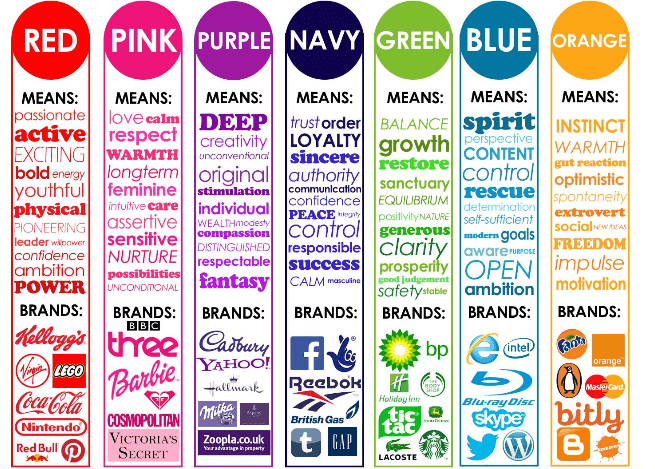
Not using color strategically

Color should always be used in a smart way. The color you use and where you use it should draw attention or elicit emotion. A good looking website is always secondary to a useful one. If the colors you pick look nice but don’t create the effect you need to convert, you are using the wrong colors. 

If you can understand the psychology of how we perceive and react to color, you can build a brand identity and website around those principles. 

Color chart that describes the marketing value of different colors with recognized brands that use each.
(image source)

Colors should also be used consistently. After building a color palette, stick to that palette and do not deviate. This way you turn the colors into a language that your user subconsciously can read. 

Forgetting to prioritize mobile responsiveness 

If you are forgetting to design your site to be optimized for small screens, you are making a huge mistake. According to this 2021 study, 68% of companies with a mobile-first website increased their sales.

Because most website browsing these days is done on mobile devices, it’s important to prioritize that experience. But you don’t need to be a highly experienced developer to ensure that your site is mobile optimized. 

Some rules of thumb for good mobile design: 

  • Use a theme that is fully responsive so it does most of the work for you.
  • Put the most important information higher up on pages so less scrolling is needed.
  • Avoid pop up messages or ads on mobile devices. 
  • Make sure buttons are large enough to be used on mobile screens. For the most important converting areas, use a button instead of a text link.
  • Use large font sizes – at least 14px!

Failing to optimize your CTAs

CTA stands for Call to Action. This is the section of your website that directly instructs or invites the user to do something. This is like the front porch to your conversion. Think of phrases like “Download the ebook now!” or “Sign up for our email list!” These are phrases likely to show up in your CTA.

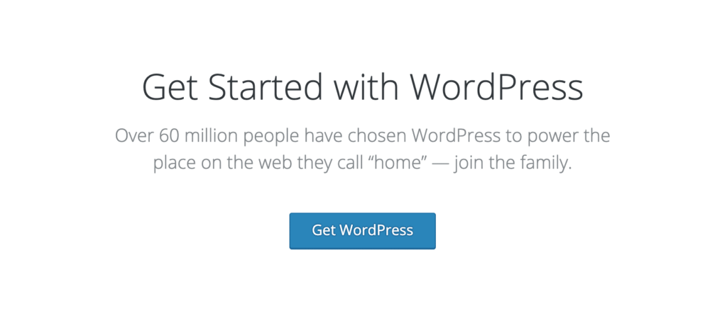
A screenshot from WordPress.org that shows a call to action for downloading wordpress.

This CTA on the WordPress.org website is great. There is a clear invitation to do something in the title. A small sentence details why you may want to complete the action. The button is large, stands out against the background, and utilizes another strop verb.

Use a CTA effectively by following some basic rules:

  • Use a strong verb like get started, download, buy, sign up. But don’t use verbs like click. How is the user supposed to know what happens when they do?
  • Make the CTA stand out. Use color and large text to do this. Maybe even make this section full width or add a border around it.
  • Don’t crowd this section. Avoid using lots of imagery! 

Links and buttons don’t stand out

More often than not, someone will convert by choosing to click a specific link or button. Like we talked about in our previous section, these areas probably appear in your CTA. 

Buttons and links should stand out strongly against not only the background of the page, but in contrast to other content. For example, if your text is black and your links are black it will be hard for people to see them. But if your text is black and your links are red and bold and underlined, there’s no mistaking them. Same for buttons. If your background is a light blue, and your buttons are blue, they might all meld together. Use a contrasting color if a button is on a colored background.

A good rule of thumb is to make clickable elements like links and buttons their own unique color! If a bright pink is part of your color palette, consider reserving it just for links and buttons. 

And remember to always underline your links so they stand out from the rest of your text. Most people who use the internet have come to understand that links are decorated with an underline. So play into their expectations and make those links easy to find! 

Using poor stock photography

Good stock imagery is relevant to the goal of the website and supports the emotional message of the rest of the content. But unfortunately, there is a ton of bad stock imagery out there. 

Cheesy photos can turn off visitors because they are impersonal, bland, or just disconnected. Avoid using photos of people that are highly photoshopped, stiff, or unrealistic.  People tend to like seeing faces in marketing, but that doesn’t mean your site needs to be coated in images of people beaming and staring directly into the camera. 

Take this example below. The people in it look posed, the photo looks incredibly edited, and the lighting is very artificial. 

Stock image of business people in a huddle.

As a contrast, look at the alternative below. The environment is much more realistic, the lighting is pretty but not overdone, and the people’s expressions look much more genuine. 

Stock photo of man and woman in business attire giving a high five.

You don’t need to hire a professional photographer to get good images for your website. Use Unsplash or Pexels to get great free options for stock photos. You’ll be able to find examples of If you want to invest some money and get better options, look at the Adobe Stock Photo library.

Real people using or interacting with your product or service will almost always be better than a stiff stock photo. Most people these days have a high quality camera in their smartphone. So consider planning a simple photo shoot for your website! 

Being too wordy with text

Your brand is important and complex. There is so much to share about your goals, mission and strategies. But like we discussed at the beginning, most people want to skim a website to find what they need. Save the verbose content for blog posts! 

When writing the content for other pages, be as concise as possible. Use headings, subheadings, and short paragraphs of text. If you’re using less text, this also helps your design be more mobile responsive. 

If nothing else, remember that people mostly skim websites. It’s a rare occurrence that someone will come to your site and take the time to read every single page from top to bottom. Good design ensures that the steps to convert are easy to find even when skimming.  If your site content is easy to skim, users can find what they are looking for much more quickly. 

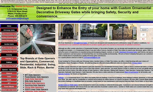
Take a look at the site below – where are your eyes supposed to go first? There is so much text here, it’s almost impossible for someone to find what they want quickly.

Screenshot of poorly designed web site.

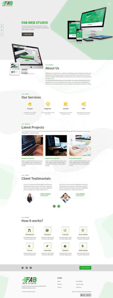
Now look at this example. See how the information is broken up with subheadings and various imagery? It’s much easier for the eye to skim over this page and find the relevant section.

Screenshot of well designed site with lots of white space.

Having sloppy navigation

Take a look at the current navigation bar for your website. Do you think someone could convert in 3 clicks or less?  If not, you may need to move some things around!

Here are some tips for organizing your navigation menu in a smart way:

Be concise: Consider “About” instead of “Learn about our company” The navigation should be simple to skim in order to find the appropriate link. 

Order links in a thoughtful way: Consider why people come to your website. If you sell boating equipment and also have a small blog to help with marketing, the links to your shop should definitely come before the blog link.

Highlight the biggest CTA: Try highlighting or outlining the link in your navigation that is most important to your website goal. For example, many nonprofits will use a big green button to make their Donate link stand out in the navigation menu.

Use existing web traffic: Look at your Google Analytics to see how people find information on your site already. Then use the navigation menu to make it easier for them. Use Behavior Flow/ User Flow to decide how to nest items. You might even notice that people are spending a lot of time on a page that is not in the navigation, and so you might want to add it.

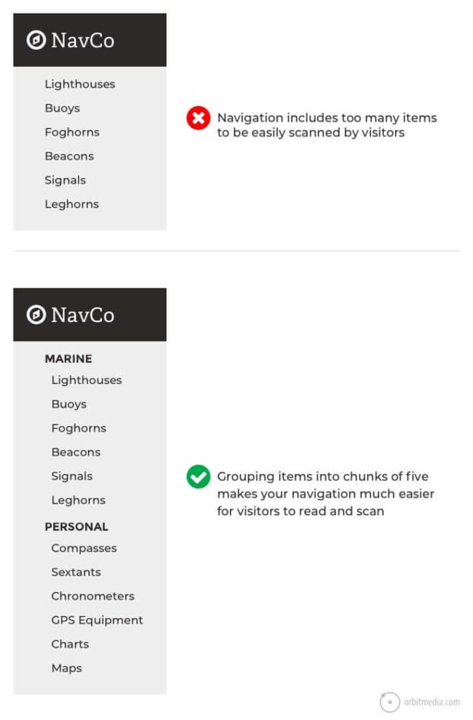
Group sub menu items: If you need to nest pages within the navigation, consider how to create groups. Long list of sub-items can be overwhelming and hard to search. If you can group long lists of links by similarity, users can find what they need much more quickly. Check out the screenshot below to see what I mean. 

Screenshot of good and bad menu grouping.

Making your text too small

We have already made our text more concise, now we need to make sure it’s readable. Some web design trends call for tiny and dainty fonts. But we want your site to be legible to everyone visiting it!  No one wants to have to squint or zoom in to find what they need. This will slow down your users and be one more roadblock on their way to converting.

  • Body fonts should be about 14px-16px. 
  • Text input sizes should be slightly larger (meaning the text people will enter into form fields)
  • Preview mobile designs on an actual mobile device to confirm legibility.
  • For text-heavy pages, like blog posts or articles, bump body fonts up to 18px or even 20px.
  • The ideal width for a block of text is 45 – 75 characters. After that, our eyes start to tire.
  • Set line height to be about 150% that of the font size.

Designing for yourself, not for your target audience

This is one of the biggest mistakes I saw when designing websites for clients. We tend to feel so close to our brand that it feels like an extension of us. We want to pick colors and designs that we like; after all, you as the business owner will be looking at this site more than anyone else! 

But it’s important to remember that in most cases you are not your target audience. The design of the site – fonts, colors, imagery, etc. – needs to connect to the people who you want to convert. The strongest design choices are made with them in mind. 

With that being said, it’s important to do your research. Who is your target audience? What do they want to see? What do they need to understand? What do you want them to feel? What information needs to be prioritized? 

Once you know all of that information, the colors and layouts and images you use must serve those needs. Your personal preference won’t play a starring role.

How to find which design mistakes are hurting conversions

So we’ve gone over all the ways that design can affect conversions. Now, let’s talk a little bit about how to learn which design choices are strongest and which are weakest. Maybe you want to experiment to see what choices will work out the best.

Luckily, there are many ways to do this. 

Heat maps

A heat map shows you where people clicked or performed other actions on your website. Heat maps look sort of like weather maps, which visual indications of where most actions were taken. Use HotJar.com to start collecting heatmaps of your website.

A/B testing

A/B testing is when you have two (or more) options and direct users to each one in equal part. So if you have two options, 50% of your traffic will see one option and 50% will see the other. You can then determine which group converted more!

User testing

Finally, just ask your audience! User testing can be conducted in so many ways. There are companies you can hire for user testing. Or you can simply ask a group of existing clients, customers, or volunteers to try out the site and tell you what they think. It can be as easy as a verbal report. Or you can create a form to collect feedback.

Remember that even a site that is perfectly designed needs to always be active, fast, and secure. A slow or glitchy site will deter users no matter how much you have optimized the design.

Cloud22 Managed Hosting checks every box. We manage your updates – making sure that when your theme developer releases an update or patch, you get it right away. We back up your site, just in case you make a wrong move in your theme settings.  Our servers are integrated with LiteSpeed cache and Cloudflare CDN, so the beautiful design you used your theme to build is served to visitors quickly.

How to Set up a Swag Store for Your NonProfit

Man and woman pack items in brown cardboard boxes.
Photo by Kampus Production

If you run a nonprofit organization, chances are you are always trying to discover new ways to fund your mission. Asking for donations is a tried and true method. But when donor fatigue sets in, you want to have options. What better way to offer options than with a swag store?

In a previous post, we reviewed why setting up a swag store is a great idea. A store brings more revenue and brand awareness to your organization. And merchandise is a great way to thank donors and volunteers. Our previous post on swag stores can help you plan everything out.

Once you have these basic concepts nailed down, it’s to build your store! This part of the process may give you pause. It can be daunting if you’ve never built a website or online store before. Luckily, you can use WordPress, WooCommerce, and Printful to build a store quickly with minimal know-how and zero coding knowledge!

Keep on reading, because in this post we are going to walk step by step through how to set up a swag store for your nonprofit with WordPress.

What programs and software do you need to set up a swag store?

You can begin building out your swag store with three simple tools: WordPress, WooCommerce, and Printful. With these three tools, you don’t need to worry about handling the merch at any point in time. There are zero up-front costs and Printful handles all the shipping for you! 

If your nonprofit’s website is already built with WordPress, you’ve already got that step covered! 

You’ll need to install WooCommerce on your WordPress website

WooCommerce is the tool that sits on top of your WordPress site. It allows you to build a store, product pages, and similar features directly on the site. It also connects to the payment processor so you can accept money for goods!

  1. Go to your WordPress Plugins page and click Add New. 
  2. Search for WooCommerce.
  3. Click Install, then Activate

The Setup Wizard will begin and you’ll be asked to answer a series of questions. This is for establishing important information right away. Answer all questions as best you can. If you currently don’t know an answer, don’t worry! You can always edit this information later.

When you’re done, go to WooCommerce, then Settings in your WordPress dashboard and ensure that your address, currency, and similar options are correctly set on the general tab. Make sure that you follow the WooCommerce documentation in order to connect to your payment gateway.

Now, create an account with Printful and connect it

Printful is the company that you can use to design and ship your merch. They connect to your site and when a product is purchased, they physically create it and ship it to the buyer. Printful is fantastic because you don’t have to buy inventory; you just pay a fee for each item sold!

  1. Go to Printful.com and click Sign Up
  2. Choose your method from the given options. As a nonprofit organization, it’s probably best to sign up using your nonprofits email.
  3. Answer all the following questions in order to build your account.

Where do you find designs for your merchandise? 

It’s not enough to just sell a t-shirt or hat through your store. It has to be branded and specific to your nonprofit. 

You can use your logo for the merch. That is the simplest option, since you should already have that image file on hand. Just make sure it’s the highest quality version of the image possible.

You can also use a custom design for your merch. This will be more expensive and time intensive, since you will need to hire a designer to do this. However, it can be unique to a special cause or fundraiser, making that merch limited edition!

It is incredibly important that you use original artwork or artwork that you already own. Never ever pull an image from Google Images to use on your merchandise!

How to set up your store using WordPress, WooCommerce and Printful 

Let’s walk step by step how to connect your WordPress site, WooCommerce plugin, and Printful account. 

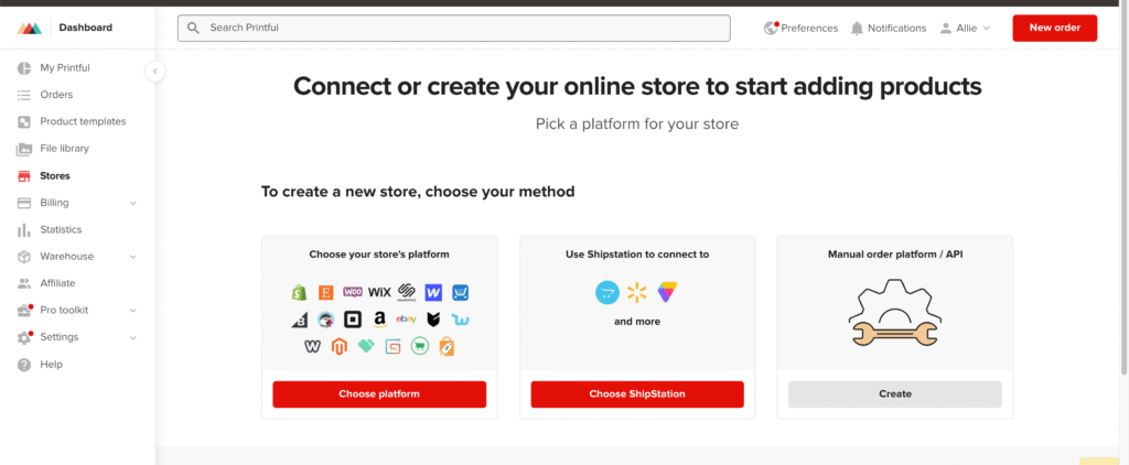
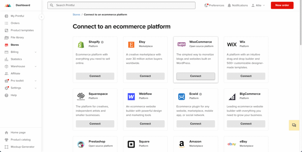
When logged in to Printful, go to Stores. Choose the “choose platform” button.

Setup Printful start screen.

Choose WooCommerce from the options provided. 

Setup Printful and WooCommerce

Choose the “set up for an existing store” tab. Printful has a handy video right there on the page for you to follow! Follow the steps as they lay them out. It’s a good idea to follow the steps directly from their website so you know the process is always up to date! 

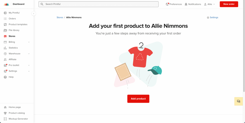
Once you’ve finished following all the steps, you should get a confirmation screen that looks something like this:

Add products to Printful

Now you’re ready to add your first product. 

Let’s do this together now so you can see how the software connects. Start by choosing Add Product from the confirmation page.

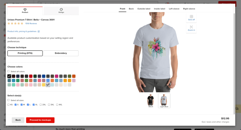
You’ll be met with a ton of options! Browse through until you’ve found the item that you want to use for your first piece of merch. I’ll go with a classic t-shirt in a women’s style.

Take your time and explore all of the customization options that Printful offers. You can drag and drop your design onto the merch, choose colors and sizes, and more.

I added a flower design, selected some sizes, and chose 2 color options:

Add design to product in Printful.

Click Proceed to Mockups to choose some display options that will show on your WooCommerce store. This is great for items that will be used; you want to show them in context so buyers can get a good idea what it would be like to use that item themselves. WHen you’re done, click Proceed to Details.

Here is where you can add a title and description. You can also just use the default text that Printful provides. When you’re done, click Proceed to Pricing.

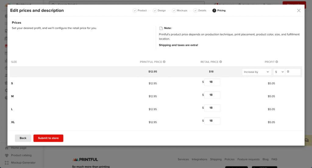
Adjust your pricing on the next screen:

Edit product prices on Printful.
  • The Printful Price is how much Printful will take in order to produce and sell the item. 
  • The Retail Price is how much it will cost the person who buys the item. 
  • And the profit is how much you will get at the end of the sale. 

If you want to make more of a profit, you can increase the retail price and Printful will do the math for you.

When you are done setting your pricing, choose Submit to Store.

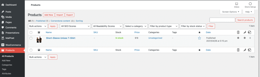
Now, we can go back to our WordPress site and choose the Products navigation item.

Add products to WooCommerce

Amazing! The Printful item has been added to our list of items with all the information we set.

How do you edit and remove items? 

Now that your store is set up and has it’s first item, we need to learn how to edit items. Maybe your cost changed. Or maybe you want to update a description. The process for editing your item is simple. 

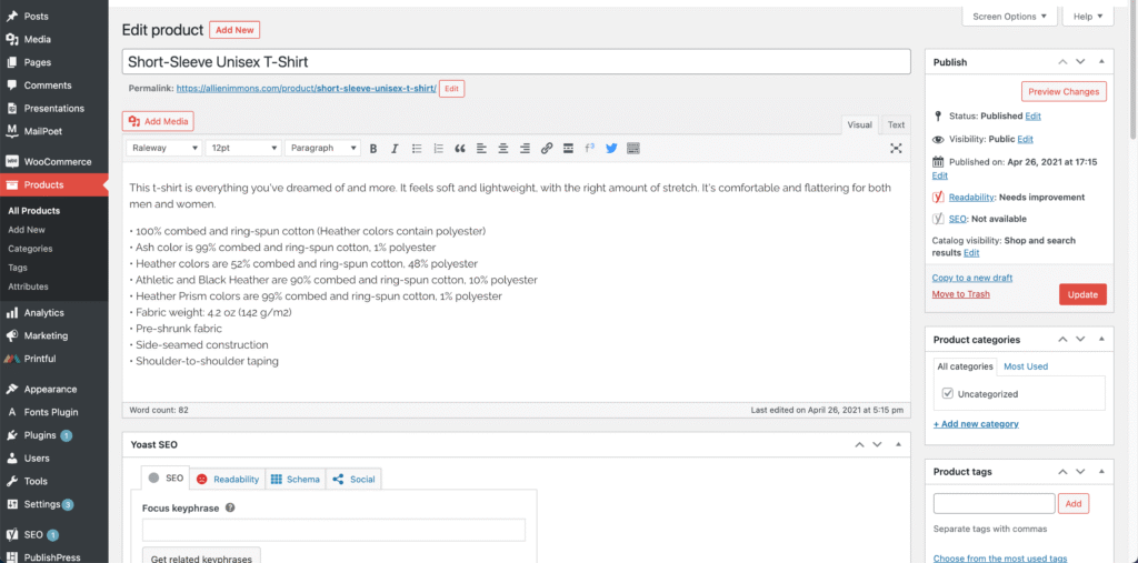
From the Products page in your WordPress dashboard, hover over the item and choose Edit.

On this page, we can edit the title, description, and category. Add a category if you don’t already have one. Categories are useful for letting buyers search your store. Examples of categories might be “clothing” “accessories” “bags” “stationary” etc.

Edit products

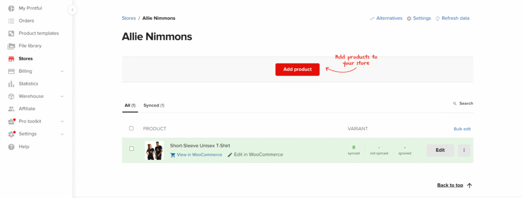
If you want to edit the product’s price or features, go back to Printful and go to the Stores page. Find your product and choose Edit.

Add more products to Printful.

Here you can edit the price, description, and more. 

Don’t want to offer an item in the store anymore? Here’s how you can remove it from the store. 

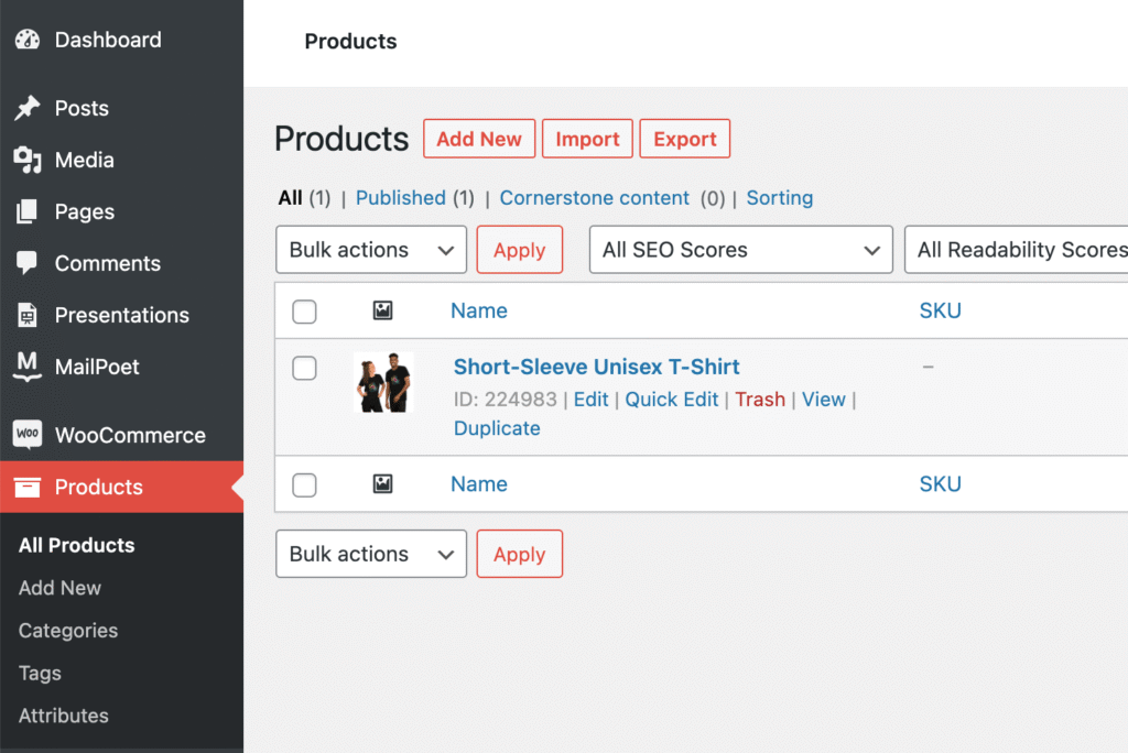
In WordPress, go to the Products page. Hover over the item and choose Trash. Super simple!

WooCommerce Products

What takes a product from good to great? 

Listing a product for sale in your swag store isn’t just about adding it in. You’ll want to pay attention to how it’s listed!

A good product title will describe what the item is, but also what makes someone want it. For example, in my example, the shirt was called “Short Sleeve Unisex T-shirt.” While this is an accurate description, it doesn’t describe the shirt in its entirety. A much more engaging title might be “Rainforest Flower Painted T-Shirt”

If you’re struggling with product names, go to an online store you shop from and look at how they name their products! 

The same can be said for the product description. A good product description gives the buyer all the information they would want about that item. Things like size and weight are good to include here. But also try to describe the feel of the product and maybe what inspired the design. If someone is on the fence about buying this item, the description is your chance to convince them!

You can also check out helpful posts like this one on how to write product descriptions that convert!

Make sure to utilize tagging and categorization to make your products easier to find in the store. Think about how you shop online. What kinds of keywords can you use to sort your items? If you’re unsure, visit an online store that sells similar items and use that as inspiration.

Use engaging photography. Printful will give you helpful mockups. But if you have any images of people wearing or using the items in real life, include those! 

How to pull sales reports from WordPress 

At certain intervals, you need to pull reports to see how much you’ve sold and how much you’ve made. With WordPress, this is very easy to accomplish.

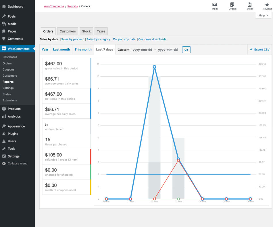
To grab sales reports, go to WordPress > WooCommerce > Reports. 

WooCommerce sales reporting.

Parse the information however you need to use the options along the left and top. When you have what you need, click “Export CSV” in the top right.

And there you have it! You are ready to start selling amazing merch through your WordPress website. If you run into a problem, don’t forget that WooCommerce and Printful both have excellent customer service teams!

Do you already have a swag store? Link it in the comments below or tweet it at us: @cloud22com

Remember that your store needs to always be active, fast, and secure. A slow or sketchy store will turn off buyers pretty quickly. If using WordPress, the hosting you choose can ensure that your store is always up, looks great, and performs fast. We definitely count good hosting as a top priority within your software stack.

Cloud22 Managed Hosting checks every box. We manage your updates – making sure that when your theme developer releases an update or patch, you get it right away. We back up your site, just in case you make a wrong move in your theme settings.  Our servers are integrated with LiteSpeed cache and Cloudflare CDN, so the beautiful design you used your theme to build is served to visitors quickly.